
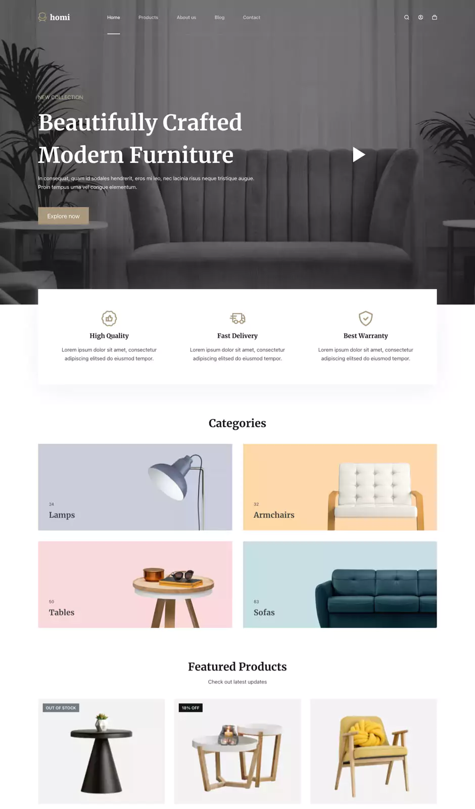

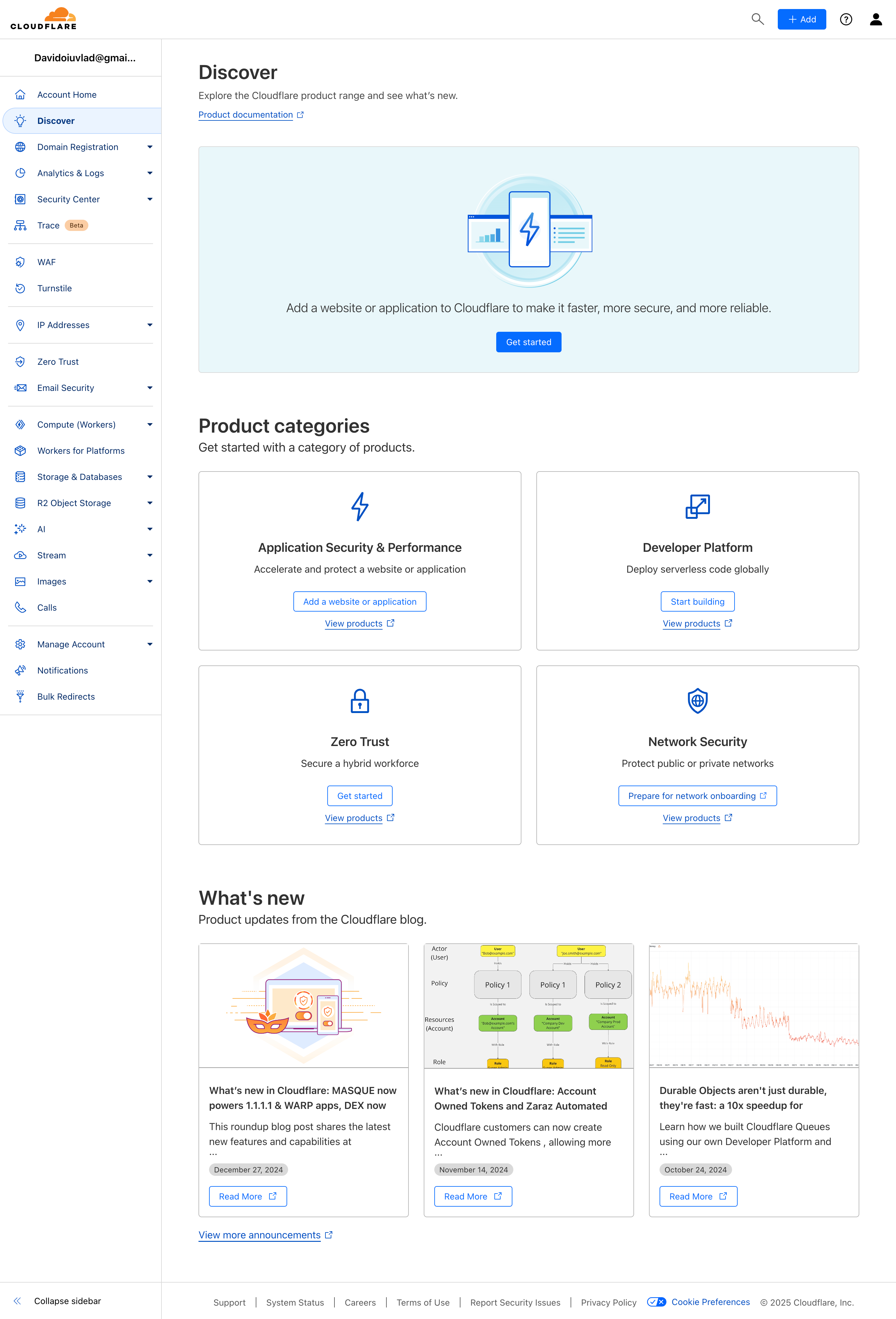




Colors play an essential role in website design. They are not just visual elements, but also have a strong impact on users’ emotions and behavior. Choosing the right colors for your site can influence how visitors perceive your brand, navigate the site and interact with the content. In this article, we explore the psychology of color and give you tips and guidelines for choosing suitable color combinations, so you can create an engaging, consistent user experience.
1. Understand the psychology of color
Before choosing the colors for your site, it is important to understand how different shades are perceived by users. For example, red can suggest passion or urgency, blue can create a feeling of calm and trust, green can be associated with nature and freshness, and yellow can inspire joy and optimism. Color psychology is complex and can vary depending on each person’s culture and experience, but in general colors can have the following connotations:
- Red: energy, passion, urgency, attention
- Blue: calm, trust, professionalism
- Green: nature, freshness, safety
- Yellow: joy, optimism, creativity
- Orange: enthusiasm, warmth, approachability
- Purple: mystery, refinement, spirituality
- Pink: femininity, love, delicacy
- Brown: stability, tradition, naturalness
2. Identify the right color palette for your brand
The colors you choose for your site should be in harmony with your brand identity. If you already have an established logo and visual identity, draw on them to choose the right colors. If you are just starting out, think about the message you want to send to your audience and choose the colors that best reflect your brand’s values and personality.

3. Use the psychology of color combinations
It’s not enough to choose a single color; it’s important to combine shades properly. In general, it is recommended to use at least three colors: a main color that will dominate the design, a secondary color for secondary elements and an accent color to highlight important points. You can also use complementary, analogous or triadic color schemes to achieve balance and visual contrast.
4. Pay attention to contrast and readability
Adequate contrast between background and text is crucial for optimal readability. Avoid color combinations that reduce text visibility, as this can make reading harder and reduce the time users spend on your site.
5. Test the colors with users
It’s always a good idea to test your chosen colors with a group of users to get feedback and see how they perceive the site’s design. This feedback can help you make adjustments based on users’ preferences and behavior.
Choosing the right colors for your site is an important process and should not be underestimated. Colors can have a strong impact on users’ emotions and behavior, directly influencing their experience on your site. By understanding color psychology, identifying a suitable palette for your brand and applying the principles of contrast and readability, you can create an engaging, consistent web design that attracts and holds users’ attention. Make sure to test the colors and get user feedback to make adjustments and optimize your site’s design for an excellent user experience.